Your company has a safety record. It probably tracks total recordable incident rate (TRIR), lost-time injuries (LTI), and days away from work. These numbers go into annual reports, bid packages, and insurance renewals.
Here is the problem: every one of those metrics measures failure. By the time your TRIR changes, someone has already been hurt. You are reading the scoreboard after the game is over.
Leading indicators tell you what is happening before someone gets hurt. They measure the activities that prevent injuries, not the injuries themselves. A safety KPI dashboard built on leading indicators lets you see problems developing and intervene before they become incidents.
Free Download: 5 Safe Work Procedures
Choose from 112 professionally written SWPs. No credit card required.
Get Free SWPsLagging vs. Leading Indicators
Lagging indicators measure outcomes that have already occurred:
- Total Recordable Incident Rate (TRIR)
- Lost-Time Injury Frequency Rate (LTIFR)
- Days Away, Restricted, or Transferred (DART)
- Workers' compensation costs
- Severity rate (lost days per incident)
These matter for benchmarking, insurance, and regulatory reporting. But they are rearview mirrors. A company with a TRIR of zero last year could have a fatality tomorrow if the underlying safety behaviors have deteriorated.
Leading indicators measure activities that prevent incidents:
- Safety observation frequency
- Training completion rates
- Toolbox talk attendance and engagement
- Pre-trip inspection completion rates
- Near-miss reporting rates
- Hazard identification and closure rates
- Corrective action completion timelines
- Safety meeting frequency and quality
- PPE compliance observed during site walks
- Permit compliance (hot work, confined space, LOTO)
The key difference: You can act on a leading indicator today. You can only report a lagging indicator after the damage is done.
Essential Safety KPIs for Your Dashboard
1. Toolbox Talk Completion Rate
What it measures: Are safety talks happening consistently across all crews, shifts, and locations?
Why it matters: Toolbox talks are the front line of safety communication. If talks are not happening, your workforce is not receiving safety information. Gaps in toolbox talk completion correlate with gaps in hazard awareness.
How to track:
- Number of talks completed vs. scheduled
- Attendance rate per talk
- Breakdown by crew, shift, department, and location
- Trend over time (weekly or monthly)
Warning signs: A crew that stops doing toolbox talks is a crew that has stopped prioritizing safety. Address it immediately.
2. Pre-Trip Inspection Completion
What it measures: Is every piece of equipment inspected before every shift?
Why it matters: Equipment failures cause injuries, property damage, and production downtime. Pre-trip inspections catch problems before they cause harm. A drop in completion rates means equipment is being operated without verification.
How to track:
- Inspections completed vs. equipment-shift combinations
- Deficiency identification rate (too low = pencil-whipping; too high = maintenance backlog)
- Deficiency resolution time
- Breakdown by equipment type, operator, and location
Warning signs: 100% completion with 0% deficiencies is a red flag, not a green one. It means operators are checking boxes without actually inspecting.
3. Near-Miss Reporting Rate
What it measures: How many near-miss events are being reported relative to work hours or headcount?
Why it matters: Heinrich's Triangle suggests that for every serious injury, there are approximately 300 near-miss events. A high near-miss reporting rate means your workforce is engaged and identifying hazards before they cause harm. A low rate means events are happening but not being reported - which means you cannot fix them.
How to track:
- Near-misses reported per month (or per 200,000 work hours for rate comparison)
- Trend over time
- Breakdown by type, location, crew
- Percentage that result in corrective action
- Time from report to corrective action closure
Warning signs: A sudden drop in near-miss reporting does not mean your site got safer. It means people stopped reporting. Find out why.
4. Corrective Action Closure Rate
What it measures: When a hazard, deficiency, or near-miss is identified, how quickly is it resolved?
Why it matters: Identifying a hazard is step one. Fixing it is the step that actually prevents the injury. A growing backlog of open corrective actions means your site is accumulating known risks without addressing them.
How to track:
- Open vs. closed corrective actions
- Average time to closure
- Overdue corrective actions (past target date)
- Breakdown by priority, type, and responsible party
- Recurrence rate (same issue identified multiple times)
Warning signs: More than 10% of corrective actions overdue is a systemic problem. Either the actions are unrealistic, the responsible parties are not accountable, or the process is broken.
5. Training and Certification Currency
What it measures: Are all workers current on required training and certifications?
Why it matters: Expired certifications mean workers are performing tasks they are no longer qualified for. In regulated industries, this creates both safety risk and regulatory liability.
How to track:
- Percentage of workers with all certifications current
- Upcoming expirations (30, 60, 90 day warnings)
- Training sessions completed vs. scheduled
- Breakdown by certification type and department
Warning signs: A worker with an expired crane certification operating a crane is an incident and a violation simultaneously.
6. Site Inspection Scores
What it measures: The overall safety condition of the work site as assessed during periodic inspections.
Why it matters: Regular site inspections capture conditions that individual task-level checks miss: housekeeping, barricading, signage, fire protection, emergency equipment status.
How to track:
- Inspection scores over time (trend analysis)
- Category breakdown (fall protection, housekeeping, electrical, excavation, etc.)
- Deficiencies identified per inspection
- Repeat deficiencies (same issue found in consecutive inspections)
- Inspector consistency (calibration between different inspectors)
Warning signs: Declining inspection scores are a leading indicator of incident risk. Rising scores with zero deficiencies may indicate inspectors are not looking hard enough.
Building Your Safety KPI Dashboard
A dashboard is only useful if the right people see the right information at the right time. Here is how to build one that works.
For Superintendents and Site Managers
Summary view. Big numbers. Traffic light colors (green, yellow, red). Answer the question "how are things going?" in under three seconds. Problems surfaced first. Details available on click but not required to understand the status.
- Overall compliance score (green/yellow/red)
- Active incidents or overdue actions (count, highlighted if nonzero)
- Today's inspection and toolbox talk status
- Flagged workers or equipment requiring attention
For Safety Managers
Trend view. Charts showing direction over time. Ability to drill into specific sites, crews, and time periods. Compare locations against each other.
- Weekly/monthly KPI trends
- Site-to-site comparison
- Near-miss and incident type distribution
- Training expiration forecast
- Corrective action aging report
For Executives
Portfolio view. High-level metrics across all sites and operations. Benchmarking against industry standards. Risk exposure summary.
- Company-wide TRIR and leading indicator rates
- Regulatory compliance status
- Cost metrics (workers' comp, lost productivity)
- Year-over-year comparison
For Foremen
Action view. What do I need to do today? What is overdue? Who on my crew needs attention?
- Today's required inspections and talks
- Open corrective actions assigned to crew
- Crew training status
- Recent near-misses in work area
Common Dashboard Mistakes
1. Too many metrics.
If your dashboard has 30 KPIs, nobody reads any of them. Pick 5-7 that matter most. Make the rest available but not front-and-center.
2. No context for the numbers.
"142 inspections completed" means nothing without knowing how many were expected. Show completion rates, not raw counts. Show trends, not snapshots.
3. All green, all the time.
If your dashboard never shows yellow or red, your thresholds are too generous. Recalibrate so that the colors actually represent risk levels, not participation trophies.
4. No action linkage.
A red KPI that nobody can do anything about is just a decoration. Every metric should link to the action required to improve it.
5. Updated monthly.
A dashboard updated once a month is a report, not a dashboard. Real-time or daily updates let you intervene while the problem is still developing.
From Spreadsheets to Real Dashboards
Most companies start with Excel. They pull data from paper forms, punch it into a spreadsheet, build a chart, and email it around. By the time anyone sees it, the data is a week old and the chart is wrong because someone fat-fingered a cell.
Make Safety Easy builds your safety KPI dashboard automatically from the data your crews generate every day:
- Toolbox talks completed with digital sign-off feed directly into completion metrics
- Pre-trip inspections with deficiency tracking flow into equipment health dashboards
- Site inspections scored and trended automatically
- Near-miss reports categorized and tracked through corrective action closure
- Training records with automated expiration alerts
No data entry. No spreadsheets. No weekly report assembly. Your crews do their jobs, and the dashboard builds itself.
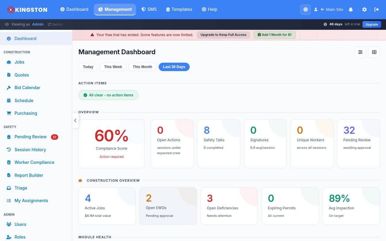
Every management page answers "how are things going?" in under three seconds. Green means good. Yellow means attention needed. Red means act now. Click any metric to see the detail behind it.
Your superintendent does not have time to hunt for information. Your safety manager does not have time to build charts. Your executive does not have time to read a 20-page report.
Give them a dashboard that works.
Go Digital with Make Safety Easy
Replace paper checklists, inspection logs and compliance binders with one platform your whole team can use - from the field to the office. Start tracking inspections, incidents and training in minutes.