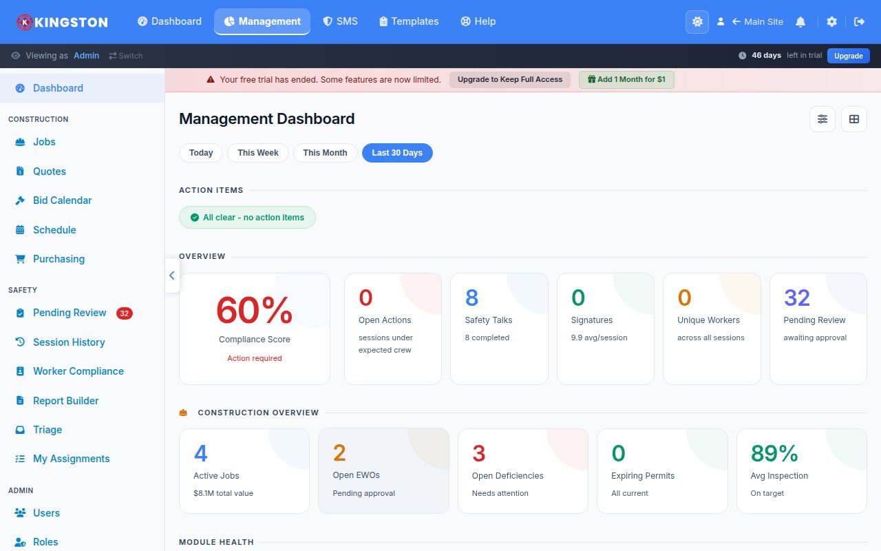
A safety metrics dashboard is a centralized visual display that aggregates your organization's key safety performance indicators - including incident rates, inspection completion, training compliance and near-miss reports - into real-time charts, graphs and scorecards. Organizations that use a safety KPI dashboard make faster decisions, identify emerging risks before they cause injuries and demonstrate measurable return on safety investment. If you are still relying on spreadsheets and quarterly reports, you are operating with a dangerous time lag.
Why You Need a Safety KPI Dashboard
Safety data is only valuable when it reaches the right people at the right time in a format they can act on. A well-built safety metrics dashboard solves the three biggest data problems in workplace safety:
- Visibility - leadership, supervisors and frontline workers can see safety performance at a glance
- Speed - real-time data replaces monthly or quarterly lag, enabling proactive intervention
- Accountability - transparent metrics create ownership at every level of the organization
Companies that implement safety performance dashboards consistently report improved inspection completion rates, faster corrective action closure and measurable reductions in recordable incident rates. The dashboard itself does not prevent injuries - but the behavior it drives does.
Free Download: 5 Safe Work Procedures
Choose from 112 professionally written SWPs. No credit card required.
Get Free SWPsLeading vs. Lagging Safety Indicators
The most effective safety KPI dashboards balance two categories of metrics. Understanding the distinction between them is fundamental to building a dashboard that actually prevents injuries rather than just counting them after they happen.
Lagging Indicators
Lagging indicators measure outcomes - things that have already happened. They are essential for benchmarking and regulatory reporting but they are backward-looking by nature.
- Total Recordable Incident Rate (TRIR)
- Days Away, Restricted or Transferred (DART) rate
- Lost Time Injury Frequency Rate (LTIFR)
- Workers' compensation costs
- Fatalities and serious injuries
- OSHA citation count and severity
Leading Indicators
Leading indicators measure activities and conditions that predict future outcomes. They are the proactive side of your dashboard and the metrics most likely to drive improvement.
- Safety inspection completion rate and timeliness
- Near-miss and hazard report submission volume
- Training completion and currency rates
- Corrective action closure rate and average days to close
- Safety observation frequency
- Toolbox talk attendance and participation
- Management safety walk frequency
For a deeper exploration of how these two categories work together, read our guide on leading vs. lagging safety indicators.
Essential Metrics for Your Safety Dashboard
Not every metric belongs on your dashboard. Too many widgets create noise. Focus on the metrics that align with your organizational goals, regulatory obligations and the specific hazards in your workplace. Below are the metrics most safety professionals consider essential.
Incident Metrics
| Metric | Formula | Target |
|---|---|---|
| TRIR | (Recordable incidents x 200,000) / Total hours worked | Below industry average |
| DART Rate | (DART cases x 200,000) / Total hours worked | Below industry average |
| Severity Rate | (Lost workdays x 200,000) / Total hours worked | Year-over-year reduction |
| Near-Miss Ratio | Near-miss reports / Recordable incidents | Higher ratio indicates better reporting culture |
Compliance Metrics
- Inspection completion rate - percentage of scheduled inspections completed on time
- Training currency - percentage of employees current on required safety training
- Corrective action closure rate - percentage of identified issues resolved within the target timeframe
- Permit compliance - percentage of hot work, confined space and lockout/tagout permits properly executed
Engagement Metrics
- Near-miss reporting volume - tracks willingness to report without fear of reprisal
- Safety suggestion submissions - measures frontline participation in safety improvement
- Toolbox talk attendance - confirms that safety communication is reaching the workforce
- Safety committee participation - evaluates leadership and worker engagement
Designing an Effective Dashboard Layout
Dashboard design matters more than most people think. A cluttered, poorly organized dashboard gets ignored. An intuitive, visually clean dashboard gets used. Follow these design principles.
Use the Inverted Pyramid
Place the most critical, high-level KPIs at the top of the dashboard. These are the metrics that leadership checks daily. Detail-level data and drill-down capabilities should live below or on secondary views.
Choose the Right Visualization
- Scorecards - best for single-number KPIs like current TRIR or inspection completion percentage
- Trend lines - ideal for showing metric direction over time (month-over-month, year-over-year)
- Bar charts - effective for comparing metrics across departments, locations or time periods
- Heat maps - useful for identifying geographic or departmental concentrations of incidents
- Gauge charts - good for showing progress toward a specific target or threshold
Apply Color Strategically
Use a consistent color system: green for on-target, yellow for approaching threshold and red for off-target or overdue. This enables instant comprehension without reading every number. Ensure your color choices meet WCAG 2.1 contrast requirements for accessibility.
Enable Drill-Down Capability
A top-level dashboard should answer "how are we doing?" in three seconds. But users need the ability to click into a metric and see the underlying data - which site, which department, which specific incidents are driving the number.
Building Your Dashboard: Technology Options
You have several paths to creating a safety metrics dashboard, ranging from DIY spreadsheet builds to purpose-built safety software.
Spreadsheet-Based Dashboards
Excel or Google Sheets can work for very small organizations, but they require manual data entry, are prone to errors, lack real-time updates and do not scale. If you have more than one location or more than 50 employees, you will outgrow spreadsheets quickly.
Business Intelligence (BI) Tools
Platforms like Power BI, Tableau or Looker can visualize safety data pulled from multiple sources. They offer powerful customization but require technical expertise to build and maintain. They also depend on clean, structured source data.
Purpose-Built Safety Software
Dedicated safety management platforms provide built-in dashboards that are pre-configured for safety metrics. The advantage is that the data flows automatically from inspections, incidents, training and corrective actions - no manual imports or custom integrations required.
Make Safety Easy includes a monthly review and reporting module that generates dashboard views from your operational safety data without any manual data wrangling.
Turning Dashboard Data into Action
A dashboard that gets looked at but never acted on is just decoration. Build these action loops into your safety management system.
Daily Checks
Supervisors review inspection completion and open corrective actions at the start of each shift. Address overdue items immediately.
Weekly Reviews
Safety managers review incident trends, near-miss reports and leading indicator performance. Identify any emerging patterns and assign follow-up.
Monthly Management Reviews
Present dashboard data to site leadership. Compare performance against targets, discuss root causes of any negative trends and approve resource allocation for improvement initiatives.
Quarterly Strategic Reviews
Executive leadership reviews aggregate data across all locations. Evaluate whether the safety strategy is working, adjust goals and plan for the next quarter.
Common Dashboard Mistakes
Avoid these pitfalls that undermine dashboard effectiveness:
- Tracking too many metrics - focus on 8-12 KPIs maximum for your primary view
- Lagging-indicator bias - if your dashboard only shows TRIR and DART, you are driving by looking in the rearview mirror
- Stale data - a dashboard updated monthly is a report, not a dashboard. Aim for daily or real-time updates
- No context - raw numbers without targets, benchmarks or trend lines are meaningless
- Restricted access - limiting dashboard visibility to the safety department defeats the purpose of transparency
Benchmarking Your Safety Performance
Your dashboard metrics gain context when compared against external benchmarks. Use these sources to calibrate your targets:
- BLS Injury and Illness data - provides industry-specific TRIR and DART averages by NAICS code
- OSHA's Severe Injury Reports - public data on reported amputations, hospitalizations and fatalities
- Industry associations - organizations like NSC, AGC and API publish member benchmarking data
- Your own historical data - year-over-year internal trending is often the most meaningful benchmark
Start Tracking What Matters
A safety metrics dashboard transforms raw data into decisions. It replaces gut feelings with evidence, turns reactive responses into proactive prevention and gives every level of your organization visibility into what is working and what is not.
Make Safety Easy delivers a ready-to-use safety KPI dashboard that pulls data directly from your inspections, incidents, training and corrective actions. No spreadsheets. No IT projects. Just clear, actionable safety performance metrics from day one. Book a demo to see the dashboard in action, or check our pricing to find the right plan for your team.
Ready to simplify your safety program?
Make Safety Easy helps teams run toolbox talks, inspections, incident reports and more - all from one platform.
Start Your Free TrialNo credit card required. 14-day free trial.